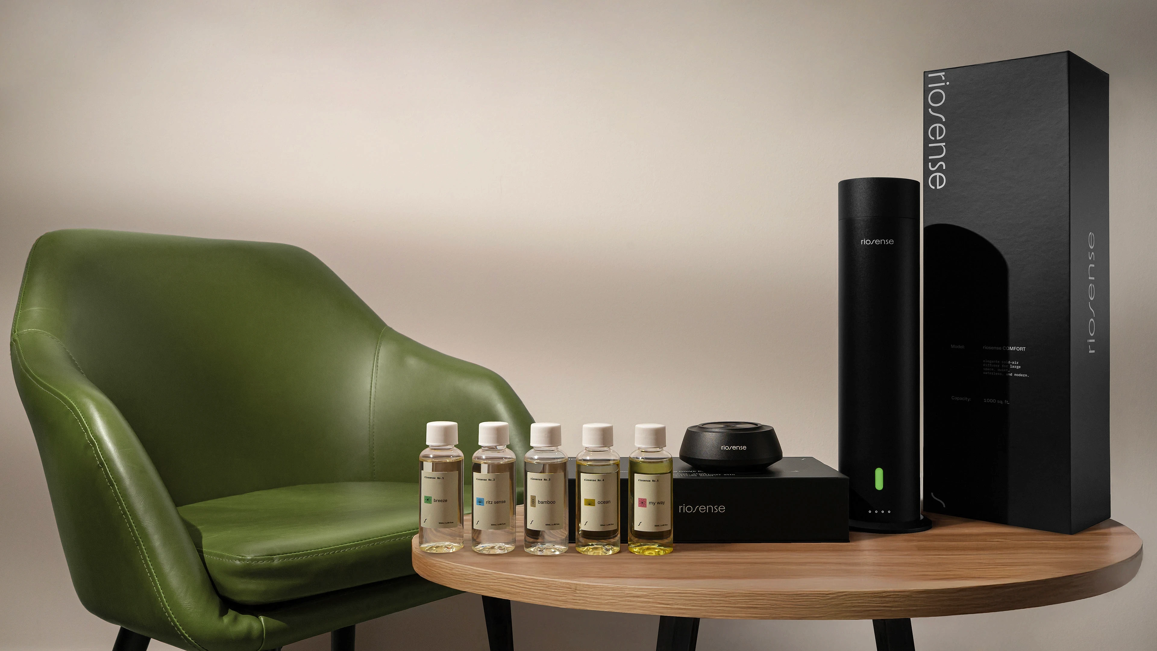
“crafted to elevate”
Riosense is a LA based brand of ambient diffusers and fragrances born at the intersection of design, sensoriality, and precision. More than scenting spaces, Riosense proposes a quiet, sophisticated, and intentional experience — where every detail communicates presence and identity.
We were invited to translate its positioning into a consistent visual and conceptual system. The challenge of the project was to build a brand that moves away from the clichéd codes of the wellness market, adopting a more architectural and refined language without compromising clarity and functionality.
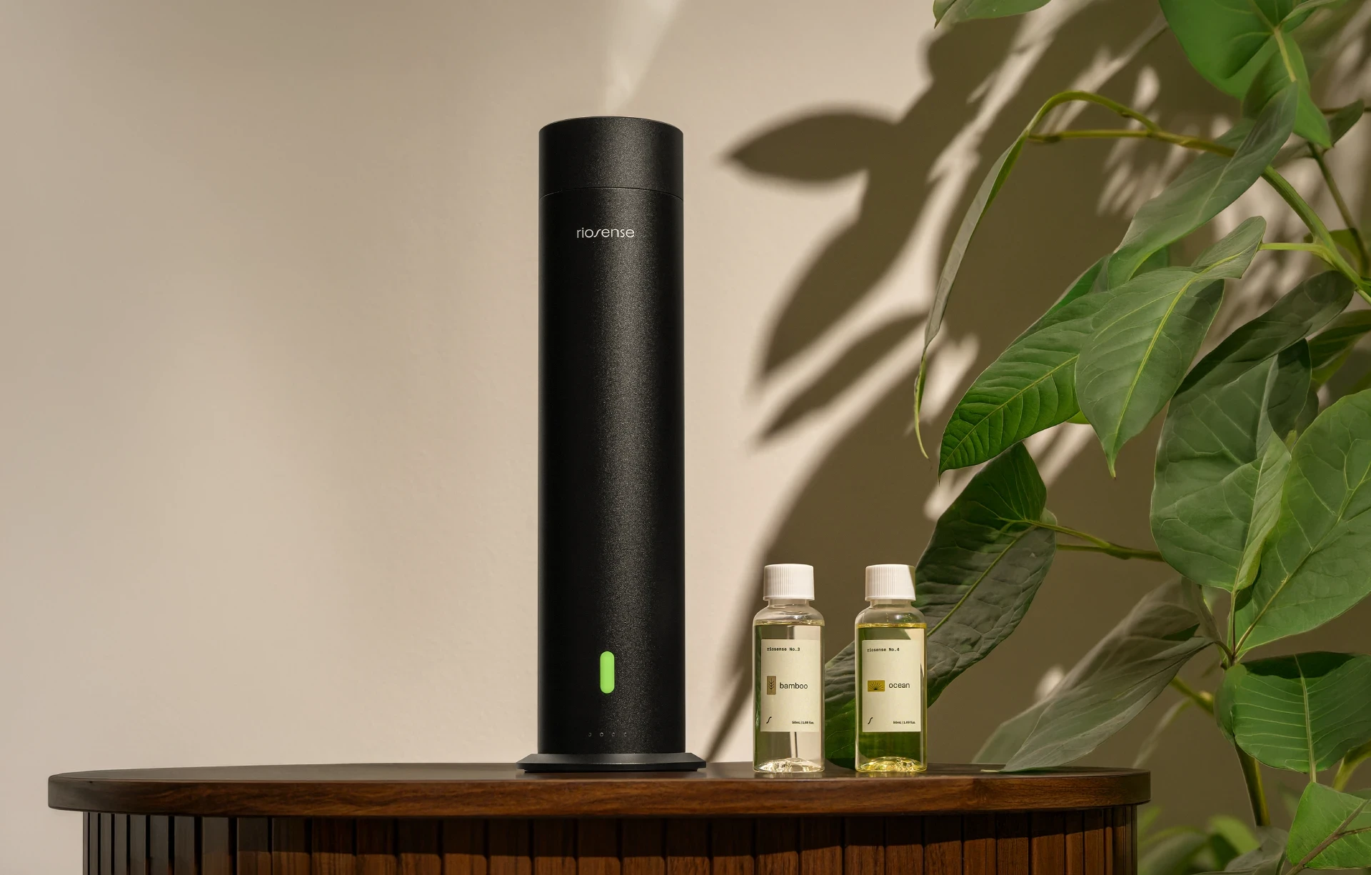
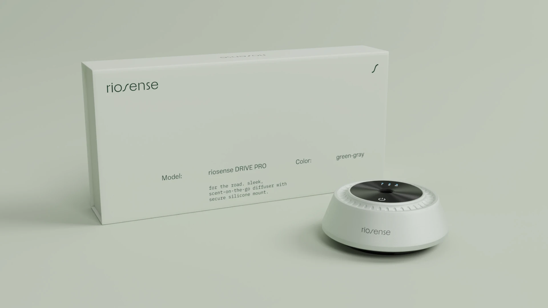
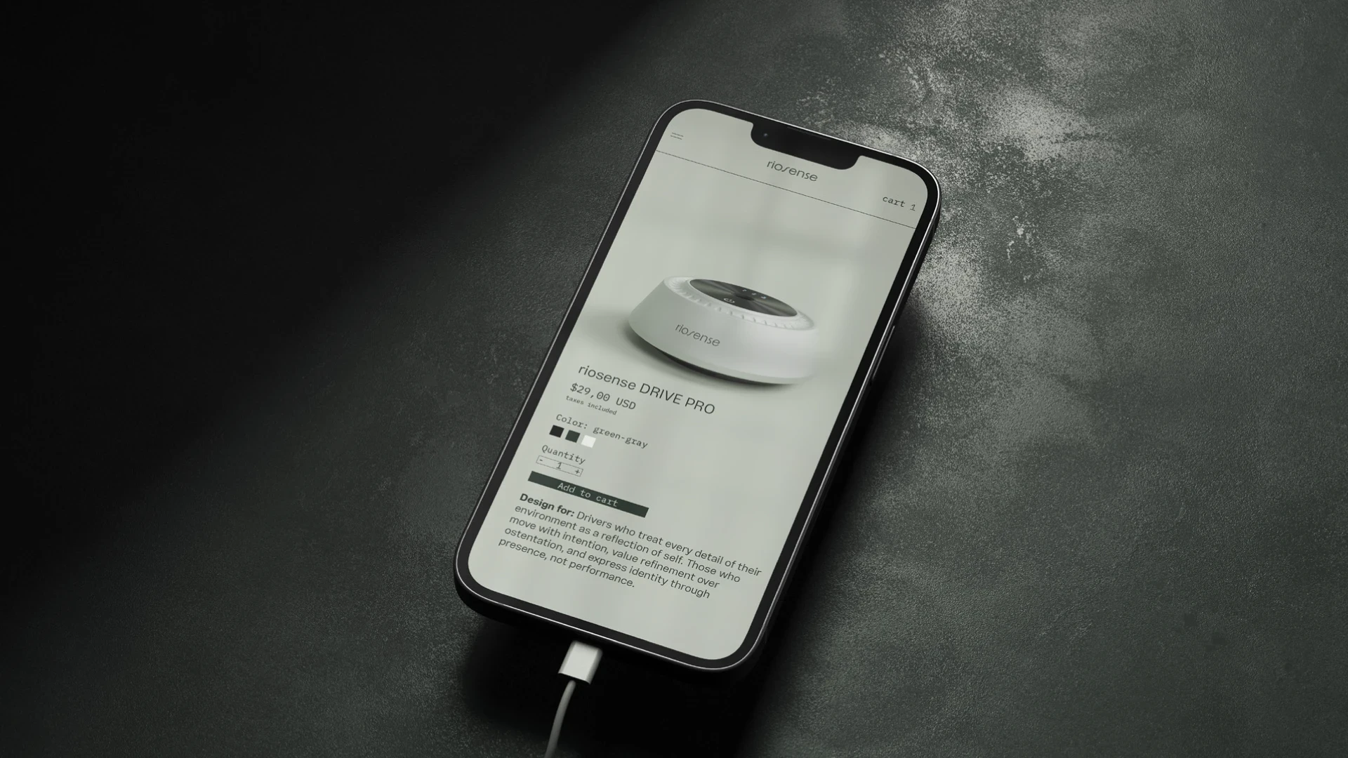
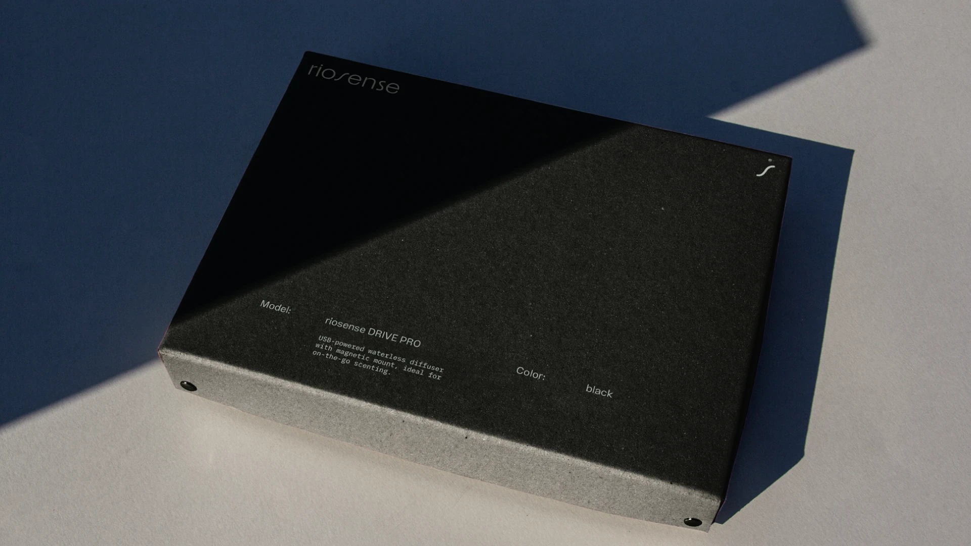
Through strategic immersion processes, we defined the pillars that guide every brand expression: minimalism with intention, sensory control, quiet materiality, and design as language. These principles shaped the development of the logotype, structural color palette, typographic system, olfactory icons, and visual guidelines for photography, product, and digital interfaces.
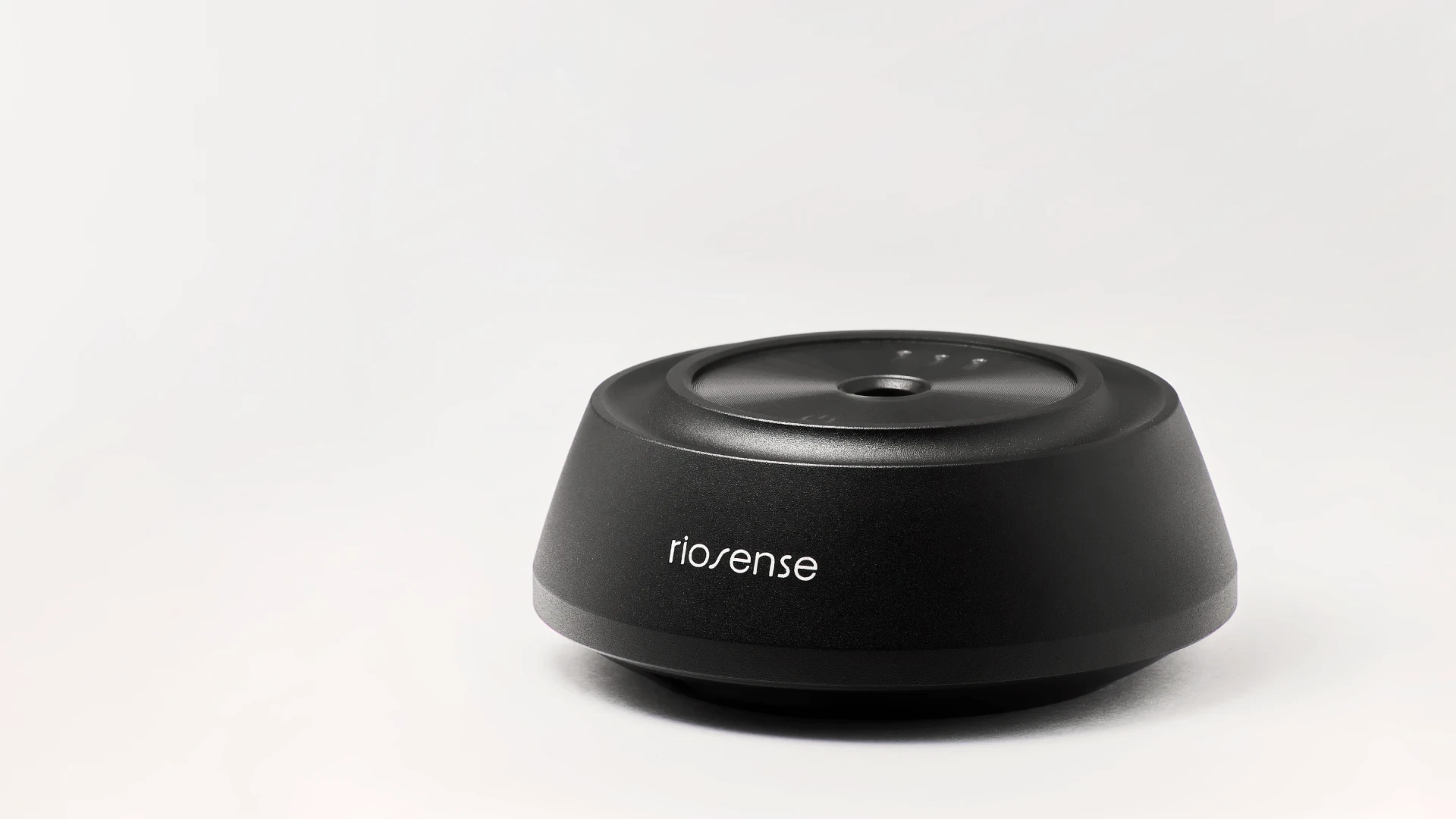
The result is a cohesive and distinctive brand universe, where every application — from packaging to digital — reinforces the essence of Riosense: sophistication without excess and design that does not decorate, but defines.
A brand built to elevate spaces, experiences, and perceptions.
“crafted to elevate”
Riosense is a LA based brand of ambient diffusers and fragrances born at the intersection of design, sensoriality, and precision. More than scenting spaces, Riosense proposes a quiet, sophisticated, and intentional experience — where every detail communicates presence and identity.
We were invited to translate its positioning into a consistent visual and conceptual system. The challenge of the project was to build a brand that moves away from the clichéd codes of the wellness market, adopting a more architectural and refined language without compromising clarity and functionality.
Through strategic immersion processes, we defined the pillars that guide every brand expression: minimalism with intention, sensory control, quiet materiality, and design as language. These principles shaped the development of the logotype, structural color palette, typographic system, olfactory icons, and visual guidelines for photography, product, and digital interfaces.
The result is a cohesive and distinctive brand universe, where every application — from packaging to digital — reinforces the essence of Riosense: sophistication without excess and design that does not decorate, but defines.
A brand built to elevate spaces, experiences, and perceptions.

Client: Browston Xaixai | riosense |
Creative Direction and Brand Universe: Eduardo Nolasco & Gabriel Martins
3D Modeling: Luiz Campolina
Year: 2025
Team: OHDUDI
Project Scope:Research | Strategy | Visual Identity | Launch | Implementation | Visual Expression | Art Direction | Brand Book | Digital and Print Brand Collaterals | Packaging | Naming of Essences |
_______
OHDUDI©2026 • All Rights Reserved
Contact us → contact@ohdudi.com
Follow us → gmartins.f | @oh__dudi | @lulu.campolina
Thanks for watching!
Client: Browston Xaixai | riosense |
Creative Direction and Brand Universe: Eduardo Nolasco & Gabriel Martins
3D Modeling: Luiz Campolina
Year: 2025
Team: OHDUDI
Project Scope:Research | Strategy | Visual Identity | Launch | Implementation | Visual Expression | Art Direction | Brand Book | Digital and Print Brand Collaterals | Packaging | Naming of Essences |
_______
OHDUDI©2026 • All Rights Reserved
Contact us → contact@ohdudi.com
Follow us → gmartins.f | @oh__dudi | @lulu.campolina
Thanks for watching!